Your bedroom is one of the few rooms in the home that should feel deeply personal and genuinely restful at the same time. The wall art you choose has a direct effect on that balance. It can soften the room, bring in color, create a focal point, or quietly reinforce a sense of calm.
Good bedroom wall art is not only about picking something pretty. It is about scale, placement, color, texture, and the mood you want to feel when the day ends and when the next one begins.
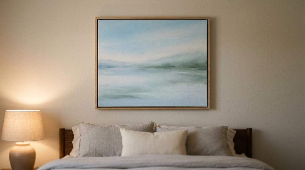
Bedroom wall art should match the mood of the room
Before thinking about frames, sizes, or wall placement, decide how you want the room to feel. A bedroom designed for rest usually benefits from art that feels gentle, spacious, and visually steady. That does not mean it must be bland. It means the piece should support the atmosphere rather than fight it.
Personal connection matters just as much as style. A quiet landscape, a soft abstract, a meaningful textile, or a handcrafted panel can all work beautifully if the piece feels right to you. Bedrooms are not public rooms in the same way living rooms are. This is the place where taste can be more intimate and less performative.
A useful filter is simple: if the artwork makes you exhale a little, it is probably headed in the right direction.
After you narrow the mood, keep these cues in mind:
- soft landscapes
- muted abstracts
- botanical subjects
- line drawings
- handcrafted textures
- Best for calm: water scenes, sky tones, minimal compositions
- Best for warmth: earth colors, wood details, woven wall hangings
- Best for personality: cultural motifs, gallery sets, meaningful symbols
Bedroom wall art size and placement need real attention
Even beautiful art can look wrong if the scale is off. One of the most reliable guidelines is the two-thirds rule. If you are hanging art above a bed, the piece or grouping should be about two-thirds the width of the headboard or bed below it. This keeps the composition balanced and prevents that tiny floating print effect.
Spacing matters too. Above a headboard, leave roughly 10 to 20 inches between the furniture and the bottom of the art. If it sits much higher, it can feel disconnected. If it sits too low, the room can feel cramped.
Large bedrooms with tall ceilings can handle oversized canvases, wide triptychs, or grouped framed pieces. Smaller rooms usually look better with one medium piece, a slim vertical format, or a tightly edited gallery arrangement. Empty wall space is not a problem to solve at any cost. Sometimes restraint makes the room feel more refined.
Common bedroom wall art placements that work well
Above the bed is the classic choice, though it is not the only one. Art above a dresser, beside a window, over a reading chair, or on the wall you face from bed can be just as effective.
If you are decorating for visual comfort, think about what you will actually see most often. The artwork you view from your pillow deserves extra thought. That is the piece most likely to shape the emotional tone of the room.
Bedroom wall art colors can change how the space feels
Color affects the room before subject matter does. In bedrooms, softer palettes tend to feel easier on the mind. Blues, muted greens, sand tones, soft grays, and warm neutrals usually create a grounded atmosphere. Bright reds, electric pinks, sharp purples, and high-contrast graphics can be exciting, though too much intensity may feel restless in a room meant for sleep.
That does not mean bold color is off limits. It simply works best when used with purpose. A mostly neutral bedroom can benefit from one controlled accent color in the art, especially if that same hue appears in a pillow, rug, throw, or lamp base.
Limited palettes often feel stronger than busy ones. When art repeats tones already present in the room, the result feels composed rather than accidental.
| Color palette in bedroom wall art | Mood effect | Best use |
|---|---|---|
| Soft blues and muted greens | Calm, restorative | Main art above the bed |
| Warm neutrals and beige tones | Quiet, open, airy | Minimal and modern bedrooms |
| Earth tones like terracotta and ochre | Cozy, grounded | Rustic, boho, or layered rooms |
| Black, white, and charcoal | Clean, graphic, crisp | Contemporary spaces with simple bedding |
| Jewel tones used sparingly | Rich, expressive | Accent art in mostly neutral rooms |
A good color strategy often follows one of these paths:
- Match the bedding or curtains
- Pull one accent color from the rug
- Use art to warm up a cool room
- Keep the palette monochromatic
- Low-contrast look: ideal for a serene, hotel-like bedroom
- Accent color look: ideal when the room needs a focal point without clutter
Bedroom wall art styles should support your decor, not compete with it
Style is where many people overcomplicate the process. You do not need a design label. You need a sense of fit.
Modern bedrooms often suit abstract canvases, minimalist line art, or quiet photography. Traditional rooms welcome florals, vintage-inspired prints, and framed paintings with a softer presence. Boho and global-inspired rooms often come alive with block prints, mandala motifs, bamboo or wood wall hangings, and textile art that brings pattern and hand-crafted character.
Nature themes remain one of the most reliable options for bedrooms. Water, sky, trees, botanicals, and distant landscapes feel open and restful. Abstract art can work just as well when the forms are gentle and the palette is controlled. If you want the room to feel more romantic or personal, try artwork with subtle curves, warm neutrals, or symbolic imagery that carries meaning without feeling visually noisy.
Gallery walls can work in bedrooms, though they usually look best when edited carefully. Fewer frames, consistent spacing, and a shared palette keep the arrangement from becoming too busy for a restful setting.
Bedroom wall art can be a focal point or a quiet layer
Some rooms need one strong piece. Others need art that sits back and completes the space.
If your bedding, wallpaper, or rug already has a lot of pattern, quieter artwork may be the smarter move. If the room is minimal and neutral, one large framed canvas or handcrafted hanging can give the room identity very quickly.
Bedroom wall art materials matter more than many shoppers expect
Material changes both the look and the day-to-day experience of the piece. Canvas has a soft, matte finish that works especially well in bedrooms because it avoids glare. Framed art behind glass looks crisp and polished, though reflections from lamps and windows can be distracting. Metal art can feel modern and durable, but glossy surfaces may catch too much light in some rooms. Wood and bamboo bring warmth and texture. Fabric wall hangings add softness and a collected feel.
Maintenance matters too. Bedrooms are usually lower wear spaces than kitchens or entryways, yet dust, sunlight, and light cleaning still matter. If you want a practical choice, framed canvas with a protective coating can be a smart option, especially in homes where easy cleaning matters. Shoppers who like layered decor often mix one framed piece with a handcrafted wall hanging or a clock to add dimension.
Here is a quick way to compare material choices:
- Canvas: matte finish, soft look, low glare
- Framed print under glass: crisp detail, classic feel, possible reflection
- Metal art: durable, modern, strong visual edge
- Wood or bamboo: warm texture, handmade character
- Textile art: soft presence, pattern-rich, best for boho or eclectic rooms
Texture deserves more attention than it usually gets. A smooth print changes the room differently than a woven hanging or carved panel. If your bedroom already has upholstered furniture, quilts, rugs, and curtains, textured wall art can make the whole room feel richer without adding visual chaos.
Bedroom wall art lighting can improve or weaken the effect
Bedroom lighting is often gentle and indirect, which is part of the room’s charm. It also means artwork may look different in the evening than it does during the day. A piece with subtle detail can disappear in a dark corner. Glass-covered art can reflect bedside lamps. Glossy surfaces may look overly bright from one angle and flat from another.
Warm light tends to flatter bedrooms best. It supports cozy tones, wood textures, and soft canvas finishes. If a favorite piece sits in a dim area, a picture light or a nearby sconce can make a real difference.
Before making a final decision, look at the art in the room during both daylight and evening light. That one habit prevents a lot of regret.
Bedroom wall art budget is really about long-term value
Price matters, though the cheapest option is not always the most economical. Very low-cost art can look fine online and disappoint once it arrives, whether because of weak printing, flimsy framing, or colors that feel flat in person.
A better approach is to decide where quality will matter most. If the piece is going above the bed and setting the tone for the whole room, it is worth buying something with solid print quality, durable materials, and a finish that will last. If you are filling a secondary wall, a smaller budget piece may be perfectly reasonable.
Curated shops that offer a mix of framed canvas art, handcrafted decor, and easy-care finishes can make comparison easier because you can judge both style and practicality in one place. That is especially helpful if you want the bedroom to feel collected rather than pieced together over time.
Bedroom wall art checklist before you buy
A quick review can keep the process focused and surprisingly stress-free.
- Mood: calming, cozy, romantic, modern, or expressive
- Scale: about two-thirds the width of the bed or dresser below
- Spacing: usually 10 to 20 inches above the headboard
- Palette: repeats room colors or adds one clear accent
- Material: matte, framed, textured, or wipe-clean
- Lighting: looks good in both daylight and lamplight
- Maintenance: easy to dust, clean, and hang securely
If a piece checks most of those boxes and still feels personal, you are close. The right artwork does not just fill a wall. It gives the bedroom its emotional center.